

TDM Spreads Festive Cheer and Road Safety Awareness
23 May 2023
TDM 2023 Aidilfitri Celebration: A Resounding Triumph of Joy and Gratitude
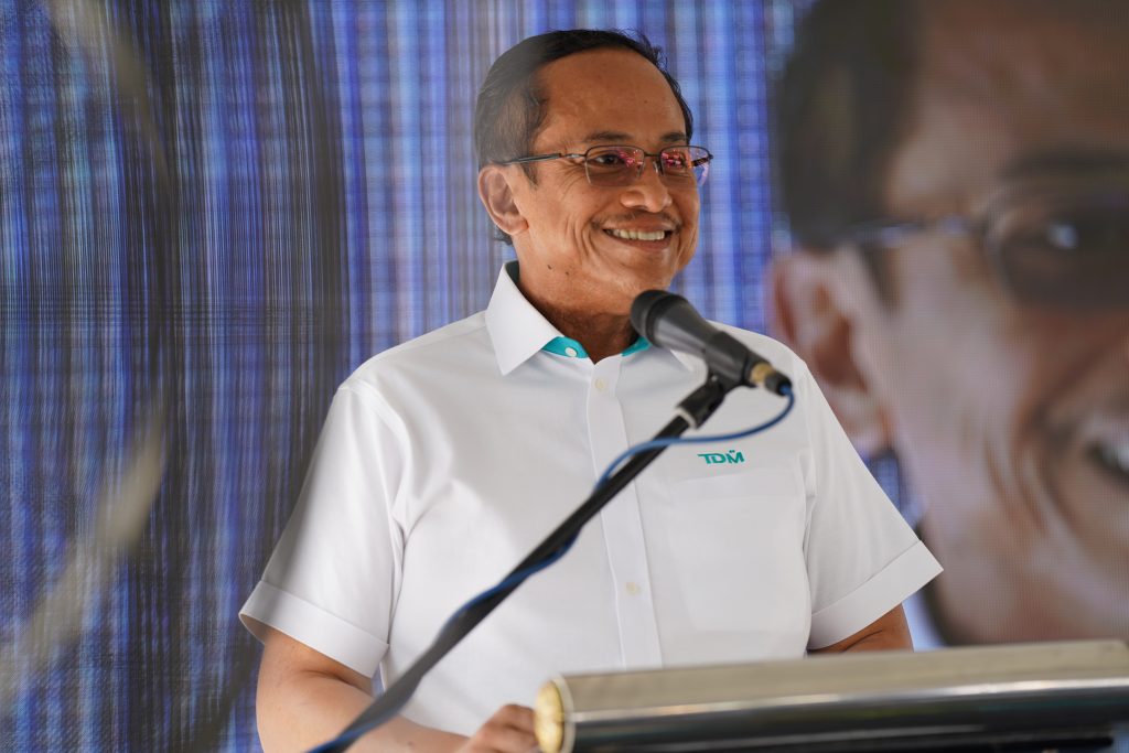
23 May 2023TDM Berhad (TDM) today made history with its grand rebranding through the inauguration of its new building, Wisma TDM along with the launch of TDM’s new logo. The change in the appearance of the TDM brand is aimed at raising the standard and strengthening the brand which at the same time proves TDM’s openness in adapting to the current pattern of change. The ceremony which took place at Wisma TDM was officiated by the Chief Minister of Terengganu, YAB Dato’ Seri Dr. Ahmad Samsuri bin Mokhtar, accompanied by Speaker of the Terengganu State Legislative Assembly, YB Dato’ Haji Yahaya Ali and TDM Executive Director, Haji Najman Kamaruddin.


TDM is a subsidiary of the Terengganu State government established in 1965 and is one of
the Shariah Compliant securities listed on the main market of Bursa Malaysia with core
business in oil palm plantations and healthcare. This indicates that TDM has been overcoming numerous challenges for 58 years to get to where it is today.


As a proud subsidiary of the state of Terengganu, TDM’s new logo incorporates aspects that
are present in the state of Terengganu. Logos play an important part in conveying a company’s image and identity. The most significant is the presence of the Jawi writing system, which symbolises the Islamic characteristics and culture of the state of Terengganu. It is a skill passed down from generation to generation by the people of Terengganu as a symbol of respect for the preservation of the authenticity of the Malay writing legacy, which is
represented by the Jawi writing “ta,” which also serves as the initial letter for Terengganu. No
matter how prosperous or unsuccessful, TDM believes that it should always go back to where
it began, its origin.


Likewise with the letter ‘M,” which symbolises the shape of the Terengganu drawbridge, which
is the first in Southeast Asia, an iconic landmark, and the pride of the Terengganu community.
Apart from that, the long line connecting ‘T’ and ‘D,” which looks like cursive, is also adapted
from Jawi writing and at the same time gives a touch of ‘batik,” drawn using lines. In terms
of colour, the main colour featured in the logo, which is turquoise, depicts harmony, wisdom,
wholeness, and growth in TDM.


This rebranding serves as one example of TDM’s ability to uphold its relevance in the business world while also demonstrating its capacity to meet stakeholders’ high expectations. TDM hopes that with this rebranding, it will be able to place TDM at a higher level in the eyes of competitors, consumers, and society as a whole.


